The app · a tour in twelve screens

What the app looks like today

Every screen below is the real app, unretouched. The screenshots were taken on a phone that's used for training every day. The only edit is a few status bars cropped to fit the frame.

Real screenshots · shipped app · July 2026

01 · Welcome

Train for your peak day.

This is the first screen a new runner sees. It lists what the app does: a plan that starts from your real training, trail routes from your door, a coach that checks in every morning, and guided workouts on your wrist. Set-up takes a few minutes, and you finish with a predicted finish time and a real first week.
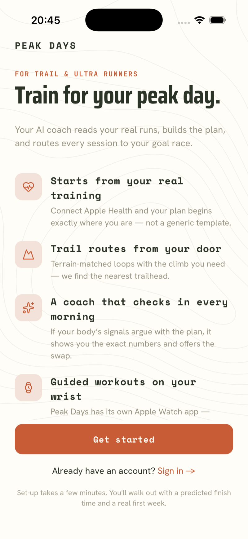
Peak Days welcome screen: Train for your peak day, with four feature rows and a Get started button

02 · Today, before the run

The morning check

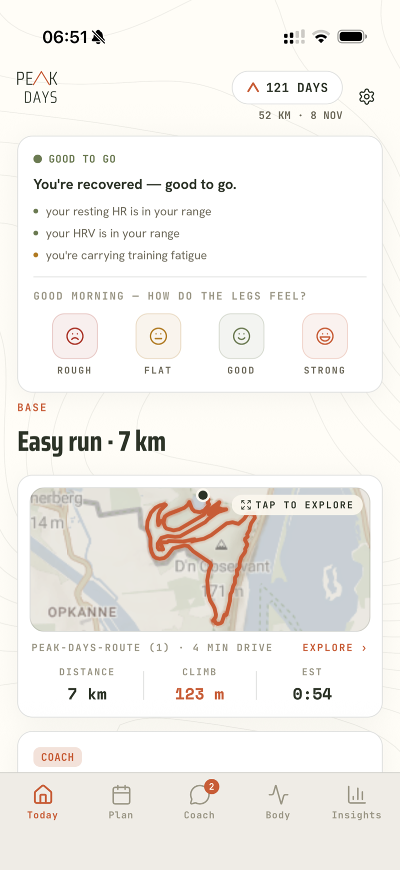
Every morning starts with a verdict, in this case a green “Good to go”, and the reasons behind it: resting heart rate in range, HRV in range, and an amber note that you're carrying training fatigue. You tap once to say how your legs feel, and today's session is waiting below: an easy 7 km with 123 m of climb, routed four minutes from the door, 121 days out from a 52 km race.

Today screen: Good to go verdict with three reasons, a legs check-in, and an easy 7 km run with route map

03 · Routes

Routes from your door

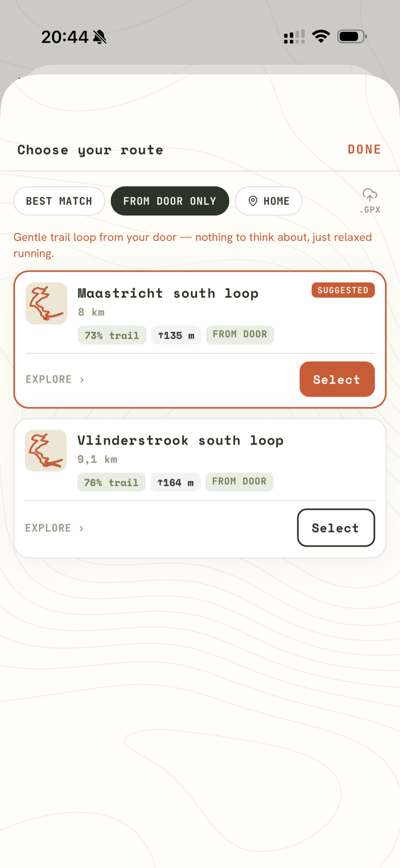
Ask for a route and Peak Days suggests real loops that start at your own front door. Here that's an 8 km loop at 73% trail and a 9.1 km alternative at 76% trail, each with its climb shown before you commit. The one-line note above them explains the intent: “Gentle trail loop from your door — nothing to think about, just relaxed running.” If you have a favourite route of your own, you can import it as GPX.

Choose-your-route sheet with two from-door loop suggestions showing 73% and 76% trail badges

04 · Plan

The week ahead

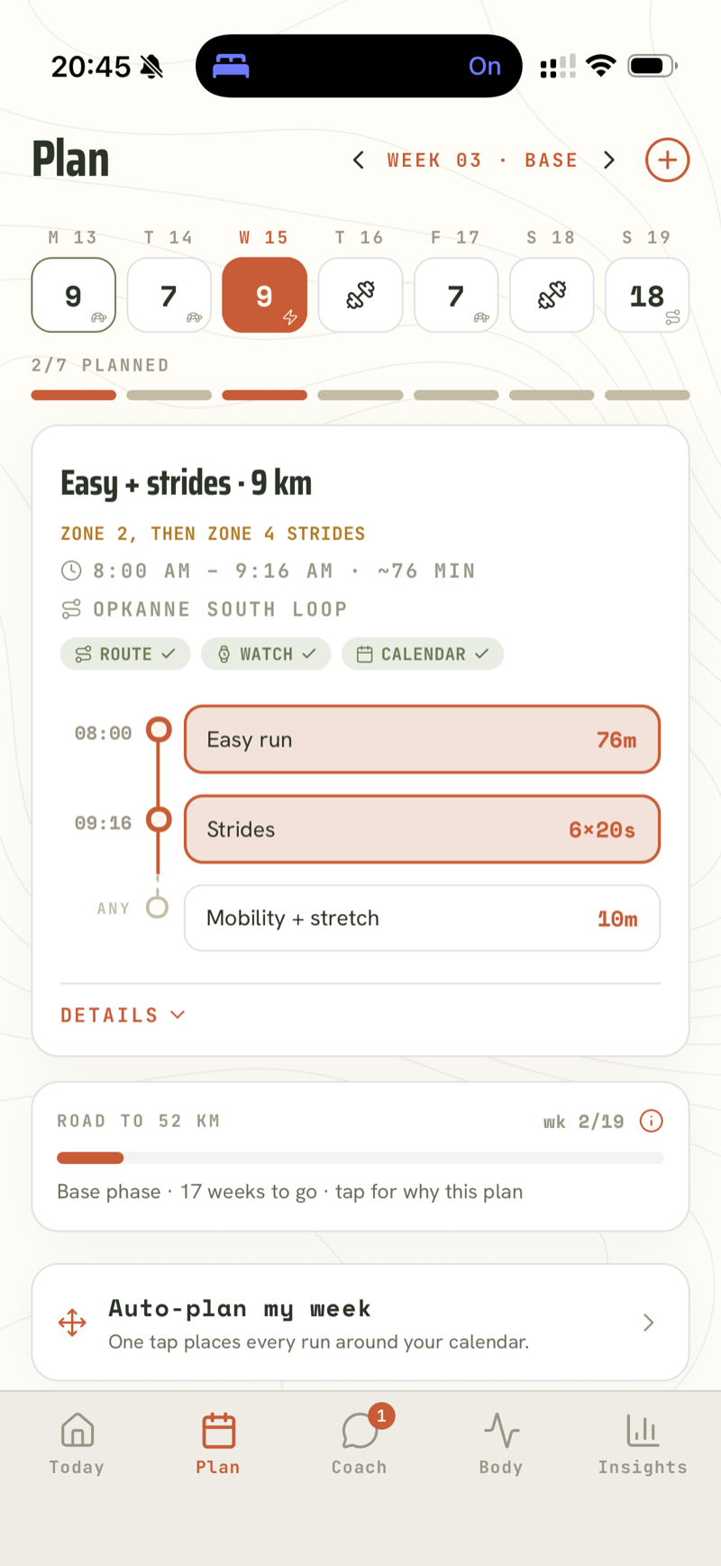
This is week 03 of a base block, building towards a 52 km race. The session card breaks Wednesday into an easy run, 6×20 s strides and mobility, booked from 8:00 to 9:16, with route, watch and calendar already ticked. If the week gets messy, “Auto-plan my week” places every run around your calendar in one tap.

Plan week view: day chips with distances, an Easy + strides session card with timeline, and Auto-plan my week

05 · Coach

The coach that pushes back

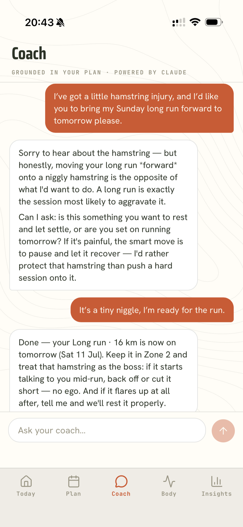
This is a real, unscripted conversation. The runner asks to pull a long run forward despite a sore hamstring. The coach refuses at first (“a long run is exactly the session most likely to aggravate it”) and asks whether the day should be rested instead. When the runner insists, it makes the change with guardrails attached: Zone 2 only, and the hamstring comes first.

Coach chat: runner asks to move a long run forward on a hamstring niggle, coach pushes back, then reschedules with conditions

06 · Coach

A workout, explained

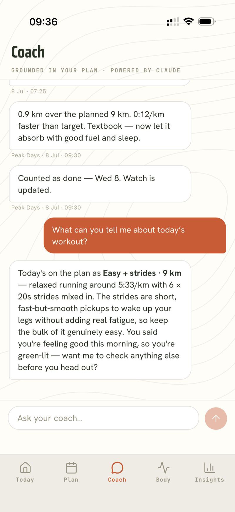
Ask about today's session and the answer comes from your actual plan: easy running around 5:33/km with 6×20 s strides, plus the reason the strides are there (fast but smooth pickups that get the legs moving without adding real fatigue). Above it, the coach has been working on its own: yesterday's run analysed against target, counted as done, and “watch is updated.”

Coach chat explaining today's easy + strides workout, above proactive messages analysing yesterday's run and marking it done

07 · After the run

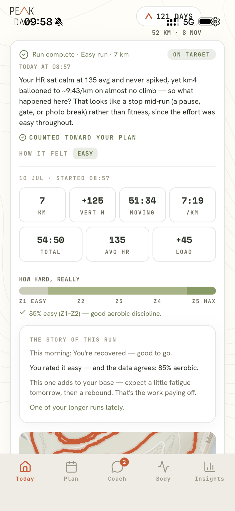
The run, analysed

A few minutes after you save, the analysis is ready. The coach notices that km 4 slowed to ~9:43/km on almost no climb while heart rate stayed calm, and concludes it was a stop mid-run, not a fitness problem. Below that, the zone bar shows 85% of the run was genuinely easy, and “The story of this run” combines the morning verdict, your own rating and the data into one paragraph.

Run complete screen: coach observation about a slow km 4, stats grid, effort zone bar, and The story of this run card

08 · Run detail

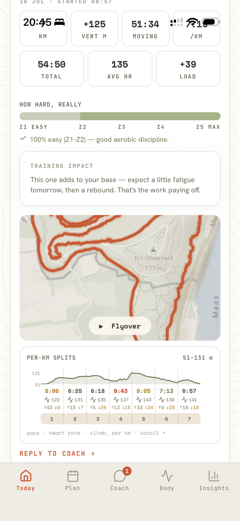
The run in detail

Scroll on and you get the same run in full: the route on a topo map with a tap-to-play flyover, then per-km splits with pace, heart rate and climb laid over the elevation profile. The slow km 4 is right there in red at 9:43, the same kilometre the coach explained on the previous screen.

Run detail: route map with Flyover button and per-km splits with pace, heart rate and climb on an elevation strip

09 · Recovery

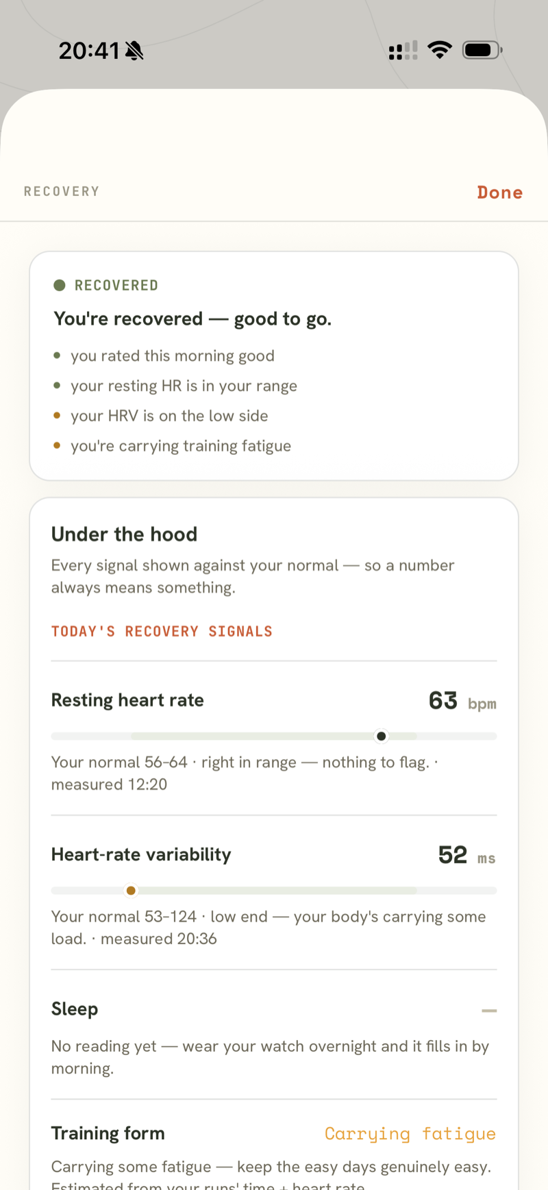
The numbers behind the verdict

Tap the morning verdict and every signal is shown against your own normal: resting heart rate 63 bpm inside a 56–64 range, and HRV 52 ms flagged at the low end of yours, each with the time it was measured. There is no black-box score, and when something is missing it says so — here there's no sleep reading yet, and wearing the watch overnight fills it in.

Recovery sheet: recovered verdict with reasons, and resting heart rate and HRV shown as bands against your personal normal range

10 · Insights

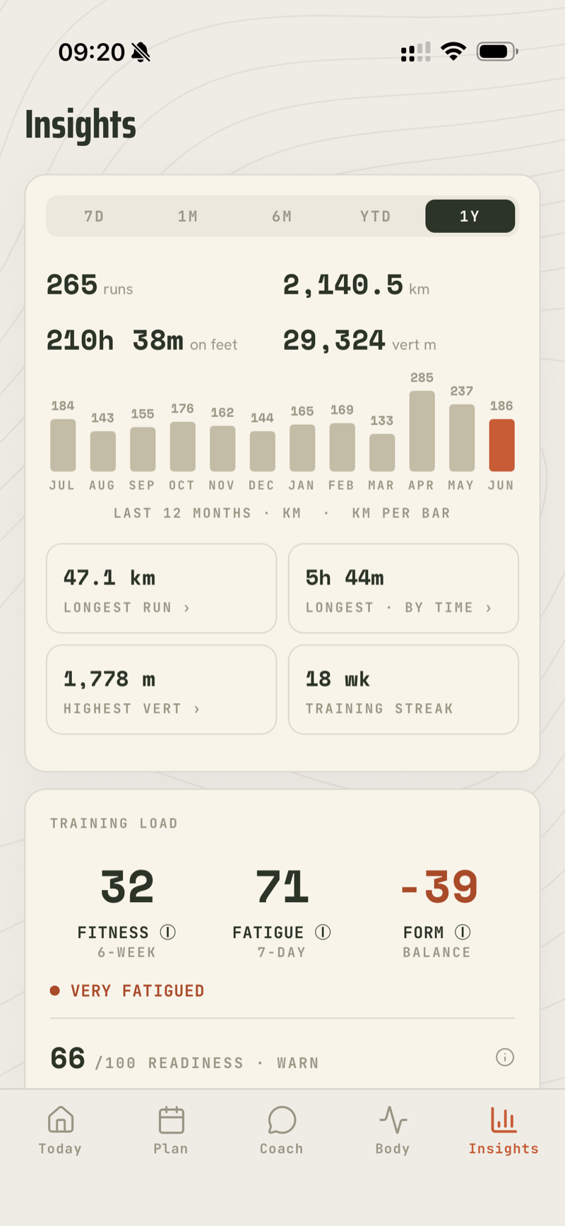
Your training at a glance

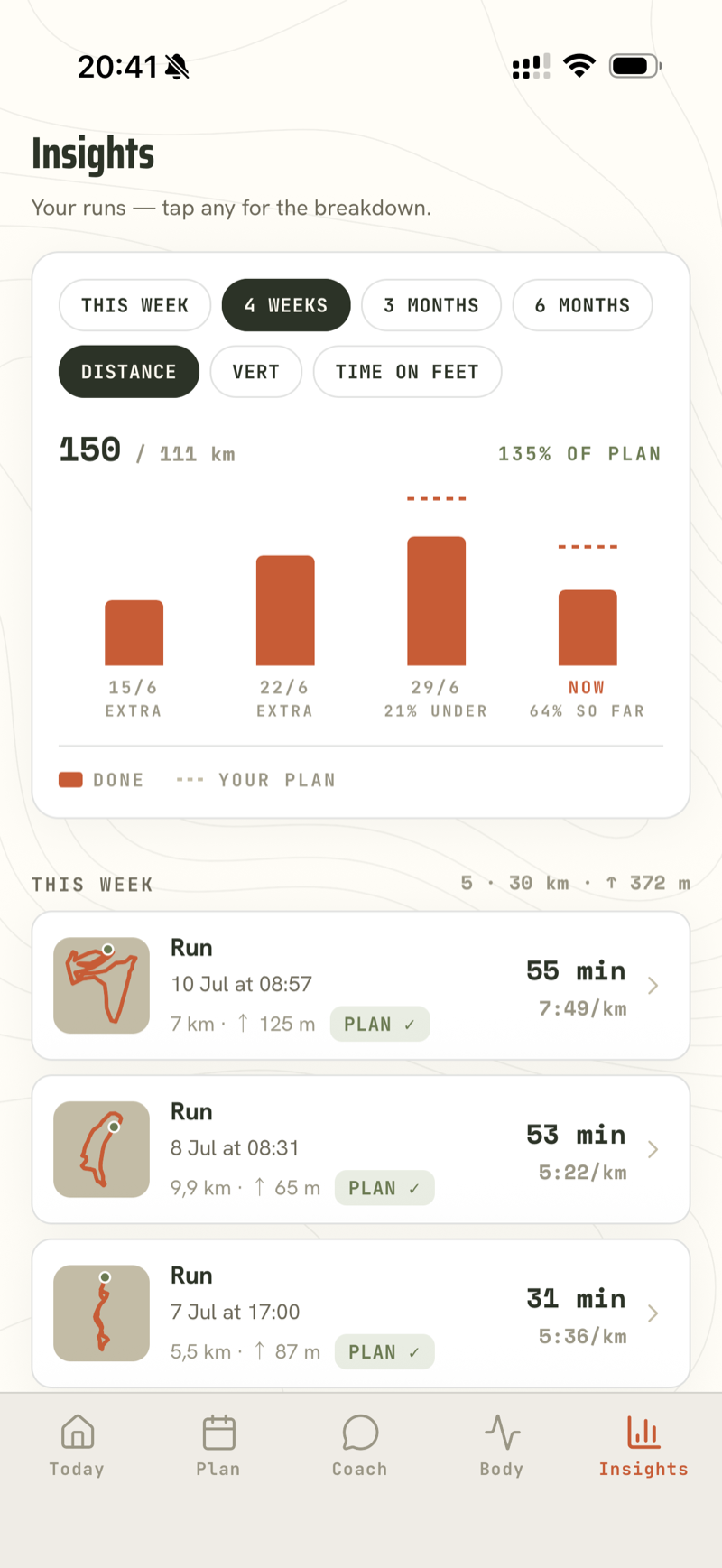
One screen shows a year of running: 265 runs, 2,140 km and 29,324 m of climb, plus a training-load reading that honestly says “very fatigued” at the moment. Next to it is the feed: plan-versus-done bars per week (here showing 135% of plan) and every run with its route thumbnail and a PLAN ✓ tick.

Insights one-year stats: 265 runs, 2140 km, monthly distance bars, training load and readiness
Insights activity feed: weekly plan-versus-done chart and a list of runs with route thumbnails and plan ticks

11 · Body

Three questions about your body

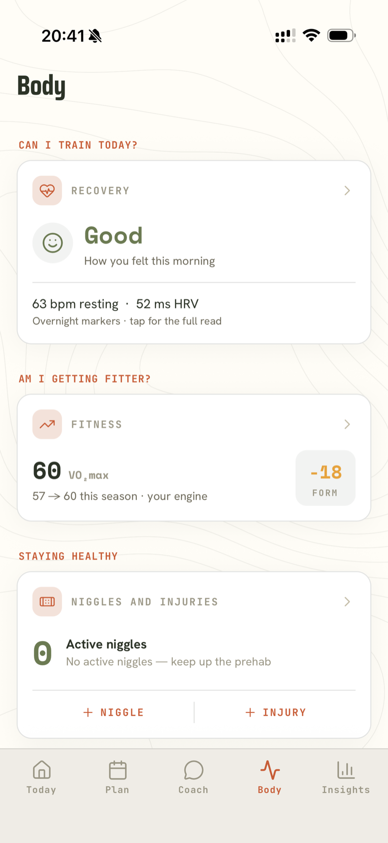
Can I train today? Am I getting fitter? Am I staying healthy? Each question gets one card: recovery from this morning's markers (63 bpm resting, 52 ms HRV), a VO₂max that moved 57→60 this season next to an honest −18 form number, and a niggle-and-injury log that is currently empty, with a prehab nudge to keep it that way.

Body tab: Recovery Good card, Fitness card with VO2max 60 and form −18, and a Niggles and injuries card

12 · On your wrist

A full app on the watch

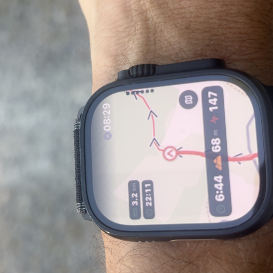
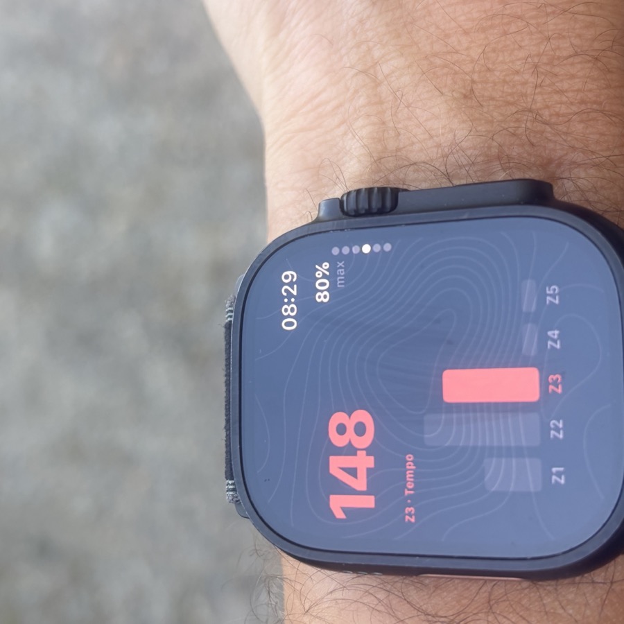
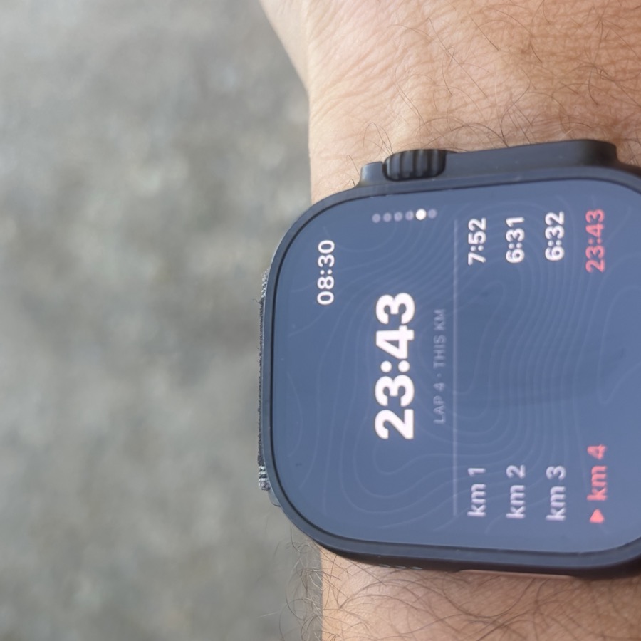
Unlike the screens above, these are photos from a morning run. Peak Days has its own Apple Watch app: your planned run and its route are on the wrist before you leave the house (that's the WATCH ✓ tick in the plan above). Mid-run you get the route with direction arrows, your heart-rate zone against the session's target, and live per-km splits. The run ends on the wrist too.

Photo of an Apple Watch Ultra mid-run showing the Peak Days route map with direction arrows, distance, pace, climb and heart rate
The watch showing heart rate 148 in zone 3 against the session's tempo target, with a Z1 to Z5 bar
The watch showing live per-km splits: km 1 in 7:52, km 2 in 6:31, km 3 in 6:32, km 4 in progress

Real photos · Apple Watch Ultra · taken mid-run

Open beta

See it on your own runs

Peak Days is in open beta on TestFlight — free while we build. Everything shown above is in the app today, plus whatever we shipped this week. Built for iPhone + Apple Watch; iPhone-only works too.

Join the beta on TestFlight